Richie Ongtengco known as "chieo" has allowed us to feature his visualization workflow using his tradional sketches as main foundation then using Photoshop to complete it. His technique is an excellent alternative workflow especially for quick concepts and showing the softness of hand drawing.
Here it is.
Step 1: The Free hand Sketch layer
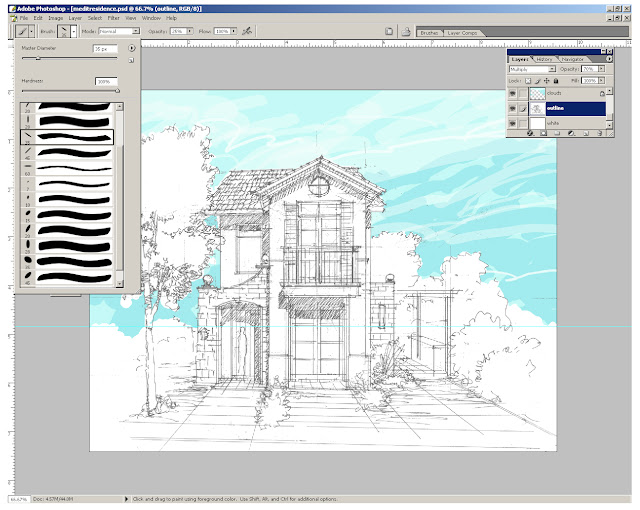
First you have to do your freehand sketch. You can scan or photograph it then paste it as your "outline" layer over the white background in Photoshop. Adjust the opacity of your layer close to 70% . The image tends to look like an "anime" presentation when the opacity is 100%. In this tutorial, we want the lines to be less prominent. Don't worry later, colors will bring out some of the details.
Step 2: Background Sky Layer
Next, we will create our background sky layer. Do this by creating new layer and name it as "clouds". Place this new layer on top of the outline layer. To create the sky background, click the brush tool. You can use the simplest round brushes; or in my case, my personal favorite are the calligraphy brushes. Set the foreground color with light cyan; then by using loose freehand movements, create some different strokes. Don't be afraid if some of the brush strokes spill beyond the outlines. Creating some spills will actually add to its natural beauty. Manipulate your brushstrokes by using different brush sizes, stokes flow, and opacity. (see image below).

Step 3: Walls, Roof and Floors
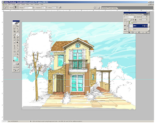
Create another layer to colorize the roof, baseboard, mouldings, stone, pavement, patio etc. Let me name this layer as "Color". You might want to create separate layer for each entity for easy revision. In this step, I am still using the same brush tool
Step 4:Windows, Jambs and Mulions
Next we will add another layer for windows, etc.You could add some depth in your windows by adding effects to the layer like inner shadow. Minimal shadows can be applied with sketchy effect. Lines can be drawn with a bit of exaggeration to emphasize the mullions.

Step 5:Trees and vegetation
This is my favorite part, rendering trees (using light and mid values), here is where you can apply those wiggly, shaky strokes using your mouse or best pen tablet mouse. Imagine the zigzag but loose strokes movements for the leaves.Here is where you will pour your detailing.
Step 6: Adding Shadows (dark shades and shadows for the trees and vegetation)
Next add another layer for darker shades and shadows of the trees and vegetation.Use darker values when using the brush tool and again you have to manipulate the opacity slider on how mush darkness or lightness you want for your shades, shadows and dark values.
Step 7: Turning off the colorize layers
To have a better view of the shadows, you might opt to hide the other layers. Only the shadow layer and sketch layer could show up (see the image below). Here all the other colors were hidden, leaving a simplified view of the outline layer and the shadows layer.
Step 8:Adding other entourage.
Below is the final render image.Extra entourages had been added..birds, people or fixtures which you can filter thru dry brush or watercolor effect.
Here it is.
Step 1: The Free hand Sketch layer
First you have to do your freehand sketch. You can scan or photograph it then paste it as your "outline" layer over the white background in Photoshop. Adjust the opacity of your layer close to 70% . The image tends to look like an "anime" presentation when the opacity is 100%. In this tutorial, we want the lines to be less prominent. Don't worry later, colors will bring out some of the details.
Step 2: Background Sky Layer
Next, we will create our background sky layer. Do this by creating new layer and name it as "clouds". Place this new layer on top of the outline layer. To create the sky background, click the brush tool. You can use the simplest round brushes; or in my case, my personal favorite are the calligraphy brushes. Set the foreground color with light cyan; then by using loose freehand movements, create some different strokes. Don't be afraid if some of the brush strokes spill beyond the outlines. Creating some spills will actually add to its natural beauty. Manipulate your brushstrokes by using different brush sizes, stokes flow, and opacity. (see image below).

Step 3: Walls, Roof and Floors
Create another layer to colorize the roof, baseboard, mouldings, stone, pavement, patio etc. Let me name this layer as "Color". You might want to create separate layer for each entity for easy revision. In this step, I am still using the same brush tool
Step 4:Windows, Jambs and Mulions
Next we will add another layer for windows, etc.You could add some depth in your windows by adding effects to the layer like inner shadow. Minimal shadows can be applied with sketchy effect. Lines can be drawn with a bit of exaggeration to emphasize the mullions.

Step 5:Trees and vegetation
This is my favorite part, rendering trees (using light and mid values), here is where you can apply those wiggly, shaky strokes using your mouse or best pen tablet mouse. Imagine the zigzag but loose strokes movements for the leaves.Here is where you will pour your detailing.
Step 6: Adding Shadows (dark shades and shadows for the trees and vegetation)
Next add another layer for darker shades and shadows of the trees and vegetation.Use darker values when using the brush tool and again you have to manipulate the opacity slider on how mush darkness or lightness you want for your shades, shadows and dark values.
Step 7: Turning off the colorize layers
To have a better view of the shadows, you might opt to hide the other layers. Only the shadow layer and sketch layer could show up (see the image below). Here all the other colors were hidden, leaving a simplified view of the outline layer and the shadows layer.
Step 8:Adding other entourage.
Below is the final render image.Extra entourages had been added..birds, people or fixtures which you can filter thru dry brush or watercolor effect.


No comments:
Post a Comment